A few months back, I got a question from a colleague about the Vivaldi Themes website:
Them: Hey. When filtering themes only one filter is applied at a time, right? Either category or color. I can’t look for Space themes in the color blue.
Me: correct
Them: Possible to implement the option to apply multiple filters?
I went on to explain that while yes, it was possible, it would require a pretty big rework of the site’s user interface.
Challenge 1: URL structure
Internally, changing the filtering logic to support querying on multiple parameters would be a very simple change. But the site navigation structure was not designed that way at all.
The original site structure gave categories and colours their own specific URLs. For example, to view all the red themes, you would go to a path of /colors/Red – there you would see a heading of “Red Themes” and all the red themes would be listed. Similarly, you could go to /categories/minimalist to see all of the themes in the Minimalist category. This was a simple structure which made for nice clean URLs, of which I am a fan. But this structure is not at all conducive to filtering on multiple parameters. While you could theoretically make something like /colors/Red/categories/minimalist work, how would the navigation UI for that look, and how far do you go along that route? What if you want to view all the “featured” themes in a specific category/colour combination?
A more traditional search UI uses querystrings, which would give something along the lines of /browse?category=minimalist&color=Red&featured=1. This is perfectly fine, but you do lose the nice simplicity of the clean URLs that we had before. I started thinking about a hybrid approach that allows both options to work side-by-side, where we not only support the use of the old URLs, but actually use them wherever possible (ie. when the search is simple enough), and fall back to the querystring-based approach for more complicated queries.
Challenge 2: user interface
The user interface was also going to need drastic changes. On the original site, all we had were a series of links to the different category/colour views, presented in 2 “drop downs”. This was going to need to be changed into a proper search form.
Now I am no designer, so this is where my colleague Fredrik came in. It didn’t take him long to come up with an initial design which is quite close to what can be seen on the new site today. This placed the search/filter UI on the left-hand side of the page, but Fredrik realized that this would present a new problem.
Challenge 3: let’s up the difficulty rating!
Ideally, we wanted the UI to be immediately responsive. If you chose a new filter, we wanted to show the results immediately, not wait for a “submit” button to be clicked. And if we were going to do that, then loading a whole new page would be a bad experience, as you would get scrolled back to the top of the page as the web browser navigates to the new search results, losing your place in the search form.
Now, loading in search results via javascript is not rocket science these days, so that was the obvious route to take, but doing it right is a bit more work.
These were my extra requirements:
- The page URL must update when the search parameters change (using the simplified URLs where possible).
- History navigation in the browser must work (if you click back in the browser, it should take you back to your previous search etc).†
- All results must be reachable and accessible even without javascript.
Of course it also had to work with the existing pagination navigation.
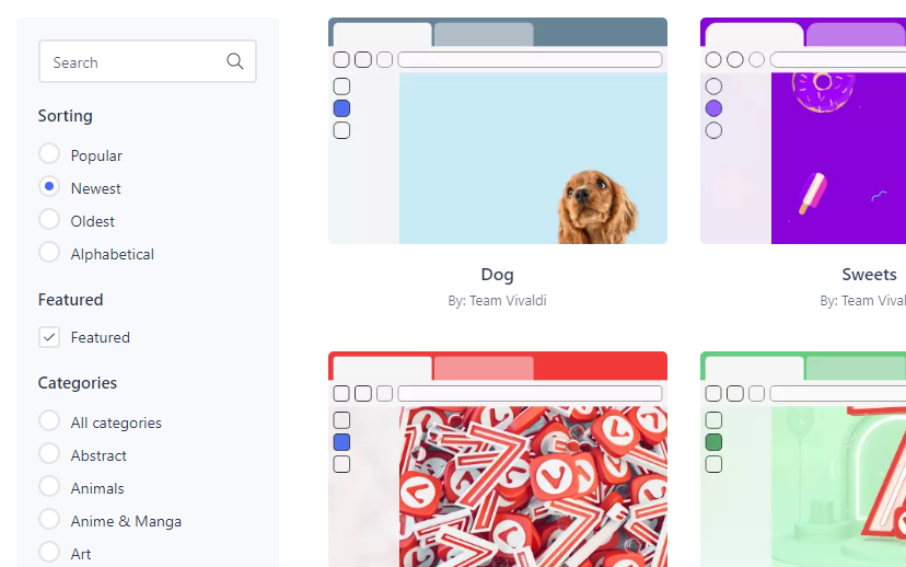
End result
About a month ago, we started working on this little project, and as you can see, we launched the new UI today.
It allows filtering simultaneously by category, colour, featured themes, and by theme name text search. The results can be ordered by popularity, by recency, or alphabetised. And it feels nice and fast to work with.
I believe it’s a good advance over what we had before. Hopefully others will like it too!
† Getting this part to work properly was extremely satisfying!
Great work Thomas, and I love how you care enough about UX to follow the important “Don’t break the back button!” principle 🙂
Thank you for your efforts.
Very nice work.
Thank you
Maybe we need cathegories for themes like “containige an own iconset” or “containig a full iconset”. I prefer themes with full iconset. The new iconset is hardly to recognize for very much people, especially without glasses.